The prompt is not the picture
How do we know when art is good?
The Mona Lisa is not our favorite painting. But we acknowledge that it must be beautiful, because each year, 10 million people are drawn to the museum to see it. So maybe things are only beautiful by consensus.
How, then, should we think of experts? When Jobs needed someone to design the iPod, then the iPhone, then the iPad, he asked Ive. He even structured Apple such that “no one at the company [could] tell Ive what to do,” including himself. We don’t have insights into Ive’s creative process. But given his track record (Airbnb. Then Ferrari. Then OpenAI), it seems people are convinced he’s onto something. So subjective domains can still have objective experts.
Which brings us to the present: how we define good design – consensus vs. experts – is being imbued on models that cost hundreds of billions to train, and are considered by most to be the economic engines of the century. Low stakes!
We have not figured out how to teach LLMs aesthetics & taste.
Forget about composition and color theory; outputs with white-text-on-white backgrounds are still shockingly common. To be fair, it's a hard problem to solve. Designs loved by many can be detested by the rest, and even the strongest pool of experts cannot satisfy all tastes.
Our fear as armchair lovers of beautiful things (and haters of the Mona Lisa) is that the attempt to solve this will either be to overindex (1) on outputs that are broadly appealing but fail to take the risks that truly captivate the audience, or (2) on user instructions for subjective tasks: always a faster horse; never a car.
This isn’t to say that instruction following is inherently bad for aesthetics.
Sol LeWitt, one of the fathers of the conceptual movement, had an entire series of pieces distributed only as instructions. Works like Wall Drawing 340 (shown below) weren't sent to museums as pre-painted panels. Instead, they were delivered alongside natural language instructions explaining how to divide the wall, the shapes that should be in each section, the color of the shading, and the volume and direction of the lines filling out the image. The resulting installation would be a manifestation of the work, but the art was the instructions themselves.
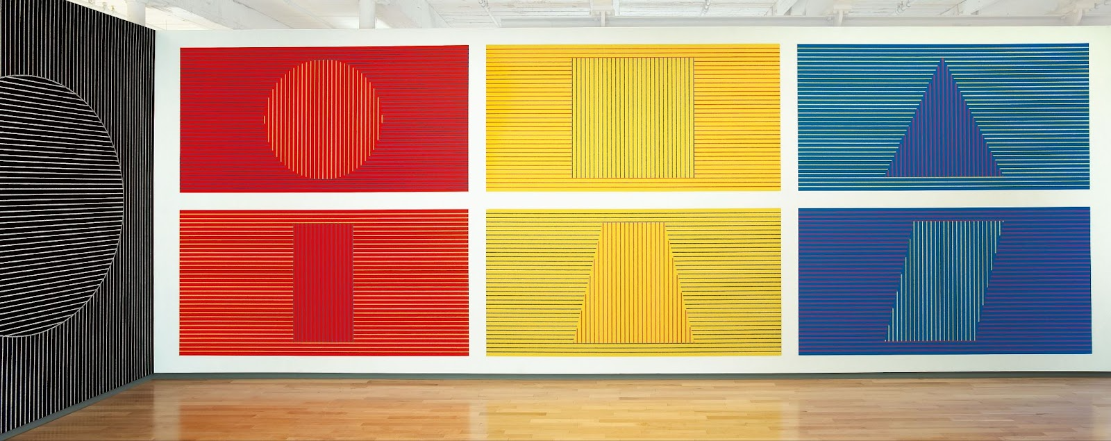
Maximal Margin wrote a prescient blog post in 2023 centered on LeWitt’s instruction art, showing that both language and image models struggled with instruction fidelity when asked to follow his prompts.
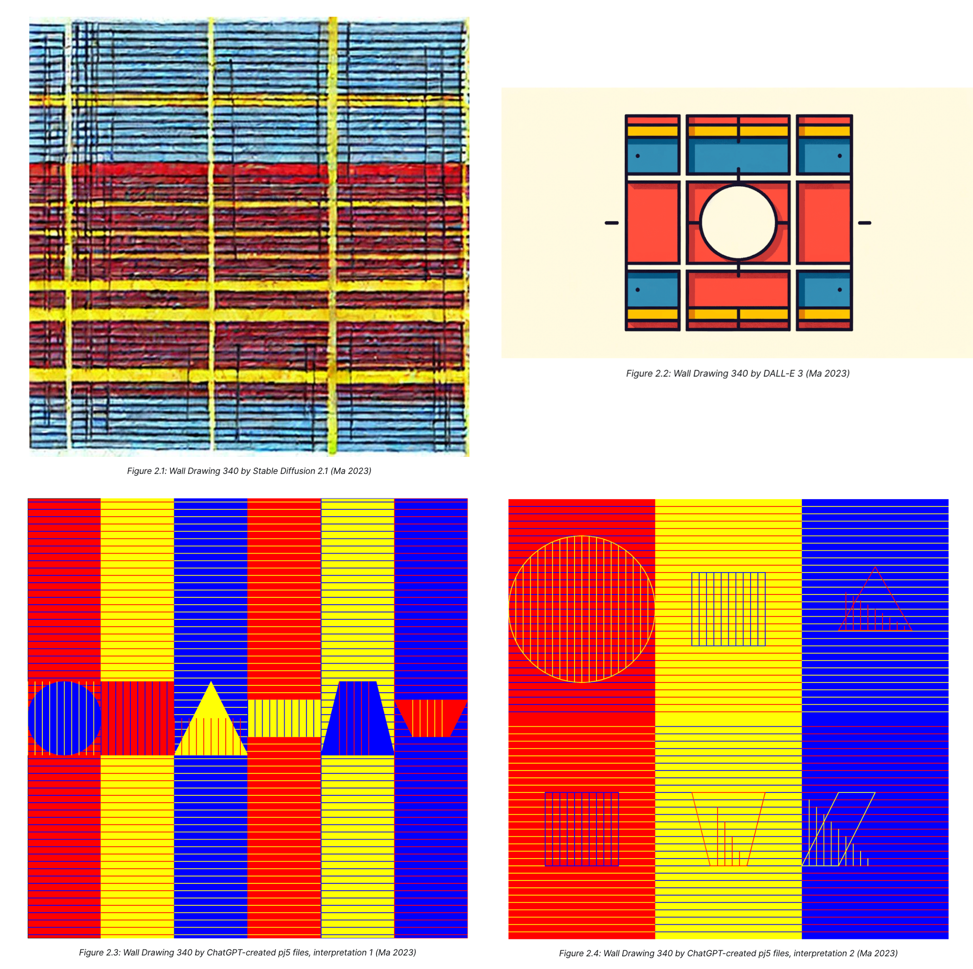
Models have improved on instruction-following since Ma’s original blog post. We generated the following versions on Design Arena using the same set of LeWitt instructions:
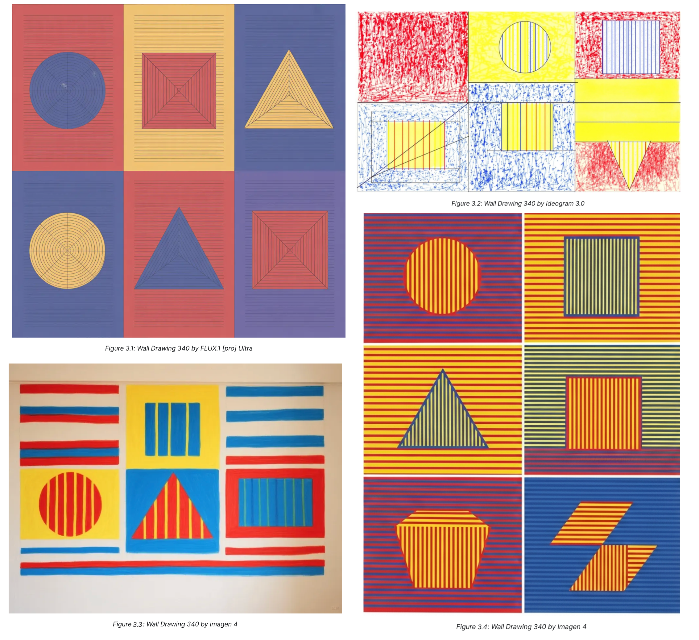
But the uncomfortable truth is that we can’t define a clear ranking for these images. Our rankings roughly follow the numeric 3.1 - 3.4 (1st - 4th) ordering shown above. But your rankings would likely vary based on your appetite for abstraction, line weights, favorite colors, and a host of unobservable preferences – not just prompt adherence.
Consider another museum installation for the same wall drawing:
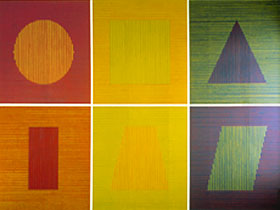
We prefer the Figure 1 (Carnegie Museum) version. To us, the scale of the walls makes the images feel more impressive. You might prefer the SF MoMA version because it’s condensed to a more digestible frame and has more vivid greens.
Instruction-following can only take you so far.
Both Wall Drawing 340 museum installations diligently followed the same set of policies. LeWitt insisted on this. Yet implementation nuances – the physical dimensions of the space, the number of lines used to shade each shape – continue to generate differences.
It's impossible to control for all of these sources of variation with a prompt. There will always be unknown unknowns, and practical constraints like writing time and context windows add additional impracticalities.
But even if we could, we shouldn't want to. Variation makes the world more interesting. The Design Arena leaderboard exists because we need a measurement of which models generate variation that users actually like. LeWitt-Bench takes this one step further. It's our systematic attempt to investigate the relationship between prompt adherence and user preferences.
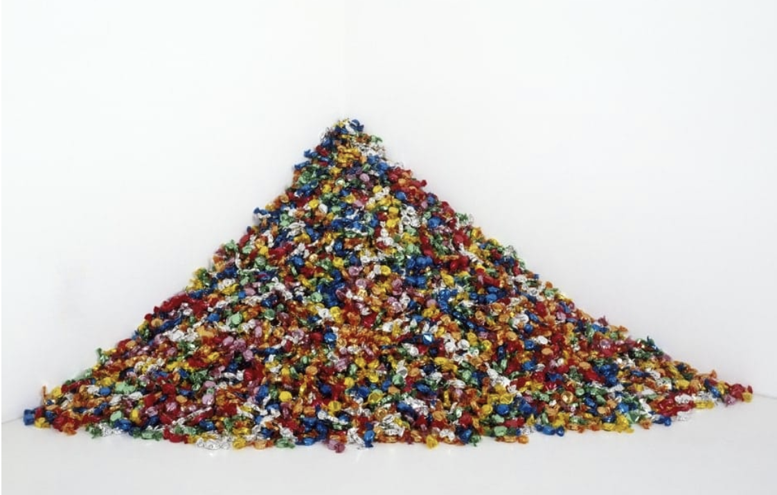
We’ll close with an illustration. Félix González-Torres, one of LeWitt’s conceptual contemporaries, wrote a set of instructions for a portrait of his partner Ross shortly after he died of AIDS in 1991. They were simple: “candies in variously coloured wrappers, endless supply, ideal weight of 175 lbs,” representing Ross’ healthy weight before he became sick.
Visitors are free to give and take candy from the exhibit as they see fit. The actual pieces are replenished once every one to two weeks – it’s conceivable for none of the originals to be in the pile after a short time. When asked about the unconventional format, González-Torres said this:
“I wanted people to have my work…. In a way this ‘letting go’ of the work, this refusal to make a static form, a monolithic sculpture, in favor of a disappearing, changing, unstable, and fragile form was an attempt on my part to rehearse my fears of having Ross disappear day by day right in front of my eyes.”
Good art isn't just defined by what we're given, but by what we choose to take.